Oggigiorno, gli utenti di Internet hanno la tendenza ad essere affascinati da effetti e dettagli innovativi mai visti in esecuzione. Questo tutorial mira ad aggiungere l'animazione delle onde nella parte superiore del tuo forum
Installazione del Codice CSSL'acronimo CSS deriva dall'inglese e significa "Cascading Style Sheets". Come dice il nome, la sua funzione è quella di personalizzare lo stile del contenuto visibile del tuo forum tramite codici scritti in formato a cascata
Non dobbiamo fare altro che andare nel nostro foglio CSS verso Pannello di amministrazione ► Visualizzazione ► CSS e immagini ► Foglio di stile CSS e aggiungere il codice corrispondente alla propria versione, per poi salvare 
AwesomeBB- Codice:
@keyframes wave {
  0% {
    background-position: 0 bottom, 0 bottom, 0 center;
  }
  100% {
    background-position: -8000px bottom, -20000px bottom, -1659px center;
  }
}

#header-banner {
  transform-origin: bottom;
  background-color: #95E4FF;
    background-image: url(https://i.imgur.com/fX1LSeC.png), url(https://i.imgur.com/Agh1uGq.png);
  background-size: 800px,800px,1800px;
  background-position: calc(50% - 200px) bottom, center;
  background-repeat: repeat-x;
  -webkit-animation: wave 30s infinite alternate;
  -moz-animation:    wave 30s infinite alternate;
  -o-animation:      wave 30s linear infinite alternate;
  animation: wave 30s linear infinite alternate;
}
ModernBB e phpBB3- Codice:
@keyframes wave {
  0% {
    background-position: 0 bottom, 0 bottom, 0 center;
  }
  100% {
    background-position: -8000px bottom, -20000px bottom, -1659px center;
  }
}

.headerbar {
  transform-origin: bottom;
  background-color: #95E4FF;
    background-image: url(https://i.imgur.com/fX1LSeC.png), url(https://i.imgur.com/Agh1uGq.png);
  background-size: 800px,800px,1800px;
  background-position: calc(50% - 200px) bottom, center;
  background-repeat: repeat-x;
  -webkit-animation: wave 30s infinite alternate;
  -moz-animation:    wave 30s infinite alternate;
  -o-animation:      wave 30s linear infinite alternate;
  animation: wave 30s linear infinite alternate;
}
Invision- Codice:
@keyframes wave {
  0% {
    background-position: 0 bottom, 0 bottom, 0 center;
  }
  100% {
    background-position: -8000px bottom, -20000px bottom, -1659px center;
  }
}

div#logostrip {
  transform-origin: bottom;
  background-color: #95E4FF;
    background-image: url(https://i.imgur.com/fX1LSeC.png), url(https://i.imgur.com/Agh1uGq.png);
  background-size: 800px,800px,1800px;
  background-position: calc(50% - 200px) bottom, center;
  background-repeat: repeat-x;
  -webkit-animation: wave 30s infinite alternate;
  -moz-animation:    wave 30s infinite alternate;
  -o-animation:      wave 30s linear infinite alternate;
  animation: wave 30s linear infinite alternate;
}
PunBB- Codice:
@keyframes wave {
  0% {
    background-position: 0 bottom, 0 bottom, 0 center;
  }
  100% {
    background-position: -8000px bottom, -20000px bottom, -1659px center;
  }
}

#pun-intro {
  transform-origin: bottom;
  background-color: #95E4FF;
    background-image: url(https://i.imgur.com/fX1LSeC.png), url(https://i.imgur.com/Agh1uGq.png);
  background-size: 800px,800px,1800px;
  background-position: calc(50% - 200px) bottom, center;
  background-repeat: repeat-x;
  -webkit-animation: wave 30s infinite alternate;
  -moz-animation:    wave 30s infinite alternate;
  -o-animation:      wave 30s linear infinite alternate;
  animation: wave 30s linear infinite alternate;
}
PersonalizzazioneE' possibile personalizzare ad esempio il colore delle onde, andando a modificare nel nostro codice CSS la parte background-color: #95E4FF; con il codice in formato HEX (esadecimale: #95E4FF) che preferiamo 
|

 Indice
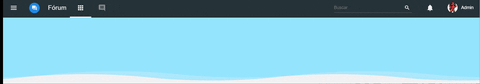

 Facebook
 Twitter
 Youtube
